ML-accelerated scientific discovery in action!
— Miles Cranmer (@MilesCranmer) October 12, 2023
This new paper in ApJ Letters uses PySR to discover a new relation between supermassive black hole mass and properties of its host spiral galaxy:
Extremely cool work!!https://t.co/JhPOY93iCv pic.twitter.com/LgRGUXmFOD
Blog
Contents
- How Music and Space Collide and Illuminate
- Monte Carlo Method – Using Probability Theory and Computer Simulations to Model Real-world Problems (Part II)
- Monte Carlo Method – Using Probability Theory and Computer Simulations to Model Real-world Problems (Part I)
- Principal Component Analysis
- Fourier Analysis
BACK TO TOP
How Music and Space Collide and Illuminate
August 26, 2019
In the sixth century BC, Pythagoras first discovered the inverse relationship that exists between the length of a vibrating string and the perceived pitch that is heard. This groundbreaking discovery enabled the predictable and reproducible creation of sound from the vibration of physical objects and laid the foundation for musical tuning and harmony.
MUSICA UNIVERSALIS (UNIVERSAL MUSIC) AKA MUSIC OF THE SPHERES
Over two millennia later, Johannes Kepler published his book “Harmonices Mundi” (“The Harmony of the World”) in 1619 AD. This work is most famous for its introduction of Kepler’s so-called "third law of planetary motion,” such that the square of the orbital period of a planet is directly proportional to the cube of the semi-major axis of its orbit. However, the bulk of the book focuses on Kepler’s extensive argument that there is a divine connection between the geometry, astronomy, and music that is manifest in the Solar System. Kepler even created musical scales for each planet based on their orbital speeds and eccentricities.

THE “ACOUSTICS” OF SPIRAL GALAXIES
Spiral structure in galaxies was first observed in Messier 51a, aka “The Whirlpool” galaxy, by Lord Rosse in 1845. Spiral density wave theory posits that density waves propagate through the disks of galaxies. These waves trigger spiral-shaped regions of enhanced star formation by locally compressing the gas and triggering increased star formation. These density waves are akin to traffic jams where individual cars may enter and then leave the location of the traffic jam, but the jam itself remains relatively stationary. This is also representative of a standing wave on a vibrating string, where the nodes of vibration remain fixed.
If this acoustic analogy is further explored, we find that the frequency of a vibrating string is also analogous to the tightness of winding observed in a galaxy’s spiral pattern. For a string of fixed length (like on a string instrument), its frequency is determined by two parameters: (i) the tension in the string and (ii) the density per unit length of the string. Similarly, the winding in a galaxy’s spiral pattern can be thought of as a frequency. It is also determined by two parameters: (i) the central mass of the galaxy and (ii) the density of the galactic disk.
On a violin, tightening a tuning peg increases the tension in a string and increases the frequency that is heard. Comparably, increasing the central mass of a galaxy increases its gravitational attraction, and pulls more firmly on the spiral pattern of the galaxy, making it tighter. Also on a violin, the thicker gauge (denser) strings vibrate with a lower frequency than the thinner gauge (less dense) strings. Likewise, decreasing the density of gas in the disk of a galaxy also speeds up the propagation of the density wave and tightens the winding of the spiral pattern, just as inhaling helium and then speaking increases the frequency of your voice.
In Davis et al. (2015), we verified from observations that this three-parameter correlation exists between the central mass of a galaxy, the density of gas in its disk, and the winding angle of its spiral pattern. Furthermore, Pour-Imani et al. (2016) confirmed the prediction of spiral density wave theory that the spiral pattern should appear slightly different when observed in different wavelengths of light. We found that spiral patterns are slightly looser when the light highlights young blue star-forming regions and is marginally tighter when the light highlights old red stellar populations. This is evidence that stars which form the spiral pattern are born in the density wave and then drift out of the density wave, just like cars emerging from a traffic jam (see also Miller et al. 2019).
See additional information and figures on the “Research” page of my website.
BEETHOVEN, CARL SAGAN, AND THE VOYAGER GOLDEN RECORDS
Which musical compositions best represent outer space? A science fiction enthusiast will probably mention the “Star Wars” movie scores by John Williams.
Although, a casual admirer of classical music will probably be able to identify that the “space” soundscapes in “Star Wars” were inspired by the legendary orchestral suite by Gustav Holst, “The Planets,” Op. 32, which premiered in 1918.
However, it would take a real scholar of Beethoven’s catalog of music to recognize that the master composer penned a hauntingly beautiful ode to the cosmos. Beethoven often took inspiration from nature for his compositions (e.g., his “Pastoral” Symphony). He completed his String Quartet No. 8, Op. 59, No. 2 in 1808. Beethoven’s former pupil Carl Czerny explained that the dreamy second movement of this work was inspired by Beethoven’s contemplation of a starry sky.
Terrestrial radio broadcasts of music have been traveling outward into the local neighborhood of our Galaxy at the speed of light ever since the first wireless transmission of music in 1906. On Christmas Eve of 1906, Reginald Fessenden broadcast from Brant Rock Station in Marshfield, Massachusetts what is likely the first piece of music to be heard via radio, the aria, “Ombra mai fu,” from Handel’s 1738 opera, “Xerxes.”
However, it is aboard the twin Voyager spacecrafts where humanity has sent hard copies of music out into the vastness of space.
It has been 50 years since mankind’s landmark achievement of the Apollo 11 mission. In doing so, NASA fulfilled President Kennedy’s charge for the United States to land a man on the Moon and return him safely to the Earth. As monumental of an accomplishment as that was, the Voyager missions (both launched eight years later in 1977) represent perhaps an even higher echelon of triumph for humanity. The series of events that unfolded throughout the 20th century, that ultimately lead to the successful Voyager missions, is genuinely remarkable.
In 1903, the Wright Brothers began the century with the first successful flight of a heavier-than-air powered aircraft, achieved by their Wright Flyer. Yuri Kondratyuk, a pioneer of astronautics and spaceflight, conceived of using gravitational slingshot trajectories to accelerate spacecraft. Without which, the interplanetary trajectories of the Voyager missions would not have been achievable. Then, the horrors of World War II brought about advances in rocket design that led to the Nazis’ V-2 rockets, which rained terror down upon London and Southeast England. It was German rocket scientist, Wernher von Braun, who helped design the V-2 rockets and later defected to the United States in the week before V-E Day. He brought his knowledge of rocket design to what would become NASA, bolstering the American rocket program. The world later witnessed the Soviets first achieve orbital flight with their space probe, Sputnik 1, that alarmed and captivated the attention of the whole world in 1957.
The concept of the Voyager missions was first envisioned by Gary Flandro of NASA’s Jet Propulsion Laboratory in 1964. Flandro noted that a rare (once every 175 years) alignment of Jupiter, Saturn, Uranus, and Neptune would occur in the late 1970s. This would allow a single spacecraft to journey the “Grand Tour” to visit all the outer planets of the Solar System by incorporating gravitational slingshots. This led to the design and launch of the Voyager spacecrafts. Voyager 1 accomplished flybys of Jupiter, Saturn, and Saturn’s largest moon, Titan, before a change-of-plane maneuver sending the spacecraft “above” the plane of our Solar System. Voyager 2 also flew past Jupiter and Saturn but remained in the plane of the Solar System to encounter the ice giant planets of Uranus and Neptune.
The Voyager spacecrafts are nuclear powered and continue to send telemetry information back to Earth. Both spacecraft have “left” the Solar System and are now traveling through interstellar space. Voyager 1 is currently the most distant man-made object from Earth at a distance of more than 21.8 billion km. Anticipating the legacy that the Voyager probes would achieve on their mission beyond our Solar System, NASA selected Carl Sagan to chair a committee to craft time capsules to accompany the probes. Voyagers 1 & 2 would be humanity’s emissaries to any extraterrestrial life or future humans that might find them adrift in interstellar space. The time capsules are two phonograph records, as well as styluses and instructions regarding their playback. Moreover, the records were cast from gold-plated copper, housed within aluminum covers electroplated with uranium-238 to enable future discoverers of the records to ascertain the age of the records via radioisotope dating.
The committee took nearly a year to decide on the content to include on the records. In their final forms, the Voyager Golden Records include spoken greetings in 55 languages, images and recordings of nature on planet Earth (including “Music of the Spheres”, a sonification of Kepler’s “Harmonices Mundi” by Laurie Spiegel), and a 90-minute selection of eclectic music from all over the world, old and new.
The varied selection of music incorporates folk and indigenous music from many cultures, including jazz (i.e., “Melancholy Blues,” performed by Louis Armstrong and His Hot Seven), blues (i.e., “Dark Was the Night, Cold Was the Ground,” by Blind Willie Johnson), and rock & roll music (i.e., “Johnny B. Goode,” by Chuck Berry).
The record also features many timeless classical masterpieces from composers including Bach, Mozart, Stravinsky, and Beethoven. These works incorporate selections from Bach’s “Brandenburg” Concerto No. 2, his Partita for Solo Violin No. 3, and his “Well-Tempered Clavier,”, Book 2: Prelude & Fugue No. 1; Mozart’s opera “The Magic Flute;” Stravinsky’s “The Rite of Spring;” and two selections by Beethoven.
From Beethoven, the committee first programmed the famous opening movement to his Symphony No. 5.
As for the second selection from Beethoven, the committee included it as the last track on the album as humanity’s final epitaph. This work is Beethoven’s Cavatina, the penultimate movement from his String Quartet No. 13, Op. 130, which would later be performed at the memorial service for Carl Sagan in 1997.
This final utterance of mankind to other potential inhabitants of the Milky Way is a fitting choice to try to convey what words cannot, in the universal language of music. The Cavatina expresses, in simultaneity, the great joy of Beethoven’s artistic offering to the world, as well as the indescribable sadness of his deafness. Its wavering melody expresses such unfathomable, unfulfillable longing, and yet a sense of isolation and loneliness that mirrors mankind’s solitude in the remoteness of space. At Sagan’s memorial service, this piece was paired with a reading from his book, “Pale Blue Dot.” The book hearkens back to the famous photograph of Earth as taken by Voyager 1 in 1990 from a distance of about 6 billion km.

Sagan pointed out that on that dot, “every human being who ever lived, lived out their lives.” In Sagan’s words, “It has been said that astronomy is a humbling and character-building experience. There is perhaps no better demonstration of the folly of human conceits than this distant image of our tiny world.”
Addendum
Beethoven's manuscript for the Cavatina. You can see tear stains on the pages; so much was Beethoven moved by what was emerging before him.
BACK TO TOP
Monte Carlo Method – Using Probability Theory and Computer Simulations to Model Real-world Problems (Part II)
August 1, 2015
To leverage the power of the Monte Carlo Method, I will next discuss the concept of Probability Density Functions (PDFs) and how they can be used alongside Monte Carlo Methods to predict outcomes of multiple input events.
PDFs are probably recognizable in the most general usage as the Bell Curve. You might recall a teacher grading your class on a "curve," this meant that there would be a distribution of grades in the class, with most of the students earning a "C." In this scenario, the curve is a Bell Curve; mathematically speaking, this is referred to as a normal Gaussian distribution (the most general case of PDF). This distribution is such that the most probable result is at the center point. This center point is also equivalent to the mean, median, and mode. Additionally, the distribution is symmetric on both sides of its center. This is the most basic PDF, but PDFs can appear in any shape (see Figure 1). In contrast, the rolling of a die is a uniform probability distribution where every outcome is equally likely, and any result other than a value on the die is impossible.
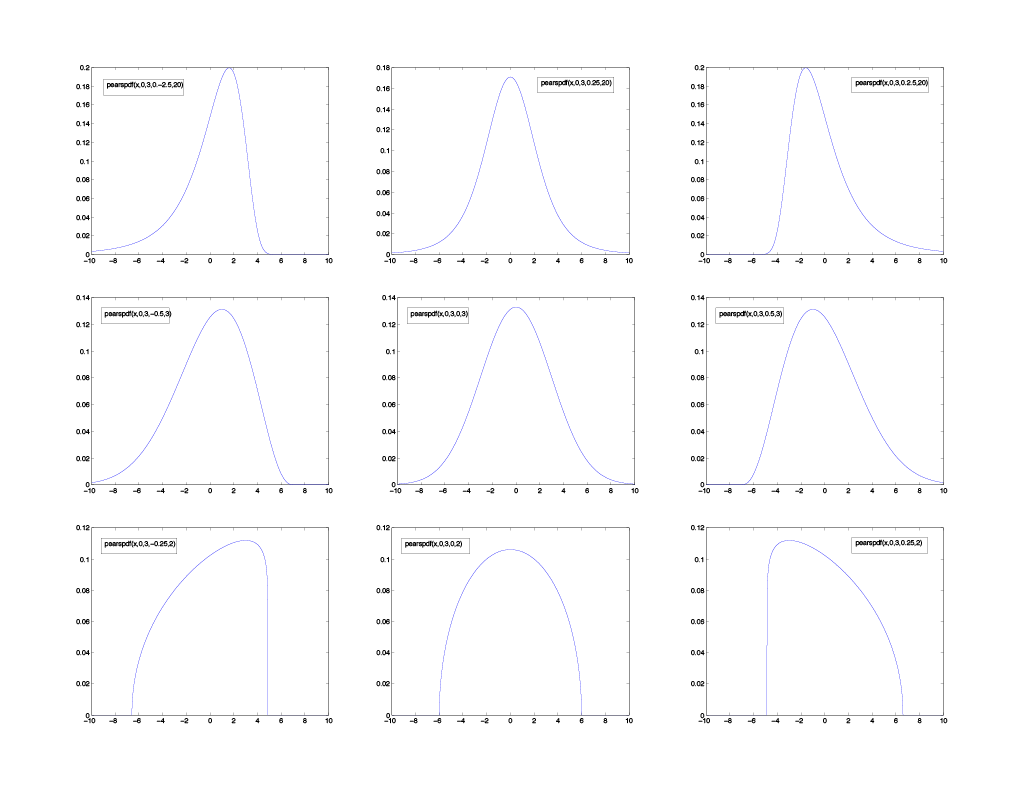
Figure 1 - Sampling of PDFs with different amounts of skew across the columns (left column = negative skew, middle column = normal, right column = positive skew) and kurtosis across the rows (top row = high kurtosis, middle row = normal, and bottom row = low kurtosis). The traditional Bell Curve (normal Gaussian distribution) is in the middle row, middle column panel.
Four factors affect how a PDF is shaped: the mean, standard deviation, skewness, and kurtosis. The mean is the average of the distribution, the standard deviation governs the width of the distribution, the skewness governs whether the distribution is skewed towards the left or right, and the kurtosis governs how sharp (or rounded) the peak of the distribution is. Based on these four parameters, a PDF can be used to represent most any distribution of data. For example, the lower left PDF from Figure 1 might be describing the cost that the same make, model, and year of a car has been sold for at a particular auto dealership. This would be logical if the price the vehicle sold for were represented increasing to the right across the x-axis because the steep vertical drop on the right side must be the sticker price. Because no one would voluntarily pay more than the sticker price, there is a sharp cutoff point there, and most buyers have negotiated for a cost somewhat lower than the sticker price (towards the left).
PDFs are potent tools because once you have modeled the shape of your distribution; you can use the resulting form to predict future occurrences. This is where Monte Carlo Methods come in. Figure 1 is representing nine separate variables, each described by their single PDF, Monte Carlo Methods can aid in performing simulated random draws from all of these distributions to access what is the total likelihood of these separate events combining in a favorable (or unfavorable) result.
For your business, if the various metrics of your business are analyzed and modeled each with their own PDF distribution, and these metrics are known to correlate to revenue predictably, then by simulating random each parameter with Monte Carlo samples, you can ultimately predict expected income with error margins. Moreover, this makes it possible to identify the metrics of your business that are performing with potential negative skews, allowing work to be focused on removing the skew and potentially turning them into positive skews.
BACK TO TOP
Monte Carlo Method – Using Probability Theory and Computer Simulations to Model Real-world Problems (Part I)
July 30, 2015
Some mathematical problems are describable by an analytical method, i.e., it is possible to represent them as a solvable equation. However, it is difficult (if not impossible) to describe many real-world problems as simple equations. Instead, numerical methods are necessary to arrive at an answer. One such method is named the Monte Carlo Method, named after the famed Monte Carlo Casino in Monaco.
The Monte Carlo Method was initially developed at the Los Alamos Scientific Laboratory for use on the Manhattan Project. Monte Carlo Methods are a general name for computer algorithms that repeat random experiments numerous times to reveal the underlying trend. For example, let's consider the probability of drawing a Royal Flush from a standard deck of 52 cards. One may use the mathematics of combinations to arrive at the correct answer by recognizing that there are four types of Royal Flushes (spades, hearts, diamonds, or clubs), and 2,598,960 different hands in a standard deck of 52 cards. Therefore, the probability of drawing a Royal Flush at random is 4 / 2,598,960 = 1 / 649,740.
Another way of discovering this probability is by actually doing the experiment, i.e., drawing 5 cards from a shuffled deck of 52 cards over and over again and record the frequency at which a Royal Flush is drawn. Obviously, this experiment would be very tedious and would need to be repeated millions of times before any sort of trend emerged. This task would not be practical for a human to perform; however, a computer is ideally suited to conduct this experiment.
As we discovered, the exact probability of drawing a Royal Flush is 1 / 649,740. Theoretically, if the experiment was performed infinitely many times by the computer, the ratio of successful Royal Flush draws to failed Royal Flush draws would indeed be 1 / 649,740. However, repeating an experiment infinitely many times (even for a computer) is impossible, the correct answer may only be approximated. Therefore, the more times the analysis is conducted, the smaller the error will be. Because a computer can easily repeat this experiment millions or billions of times in rapid time, the error for this result can be reduced to a negligible amount.
For example, I conducted this experiment on my personal computer (a 2008 iMac with a 2.66 GHz Intel Core 2 Duo and 4 GB of RAM) by simulating 10 billion random draws of 5 cards from a deck of 52 cards. The result I obtained was that on average, a Royal Flush was drawn once every 652,401 hands. This result is only 0.41% different from the correct answer of theoretically drawing a Royal Flush once every 649,740 hands. Even on my 7-year old computer, this experiment took only about 4.5 minutes. Newer, faster computers could potentially perform even more random draws in less time, yielding increased accuracy. In actuality, computations of this nature can reduce the error by half by quadrupling the number of samples.
Look for part II of my discussion of the Monte Carlo Method coming soon, where I will discuss using probability density functions and applying them in coordination with Monte Carlo simulations to predict outcomes for more significant, more complex problems.
BACK TO TOP
Principal Component Analysis
July 10, 2015
Some parameters can be intuitively thought to correlate. For example, you might expect that human height should directly correlate strongly with shoe size (i.e., taller people tend to have bigger shoe sizes and vice versa). An example of an indirect relationship could be as global temperatures rise, global ice cover decreases. Both direct and indirect relationships are essential in forecasting for future results.
Imagine that you are looking at a large dataset and you are trying to find variables that correlate with each other (either directly or indirectly). One way to do that is to plot one variable versus another variable, two at a time until you have compared every variable against every other variable in your dataset. This brute force will achieve the desired result of finding two-parameter correlations, but if the dataset is large, this may take quite some time, require close inspection, and not reveal any information about the existence of multi-parameter correlations. For example, the Ideal Gas Law shows that the temperature of an ideal gas is related to both its volume and pressure.
Let's take as an example dataset, the results of decathletes who participated in the 2004 Olympic and Décastar games. Figure 1 shows the results (time or distances) of each competitor in each of the ten events, plotted one at a time against every other competition.
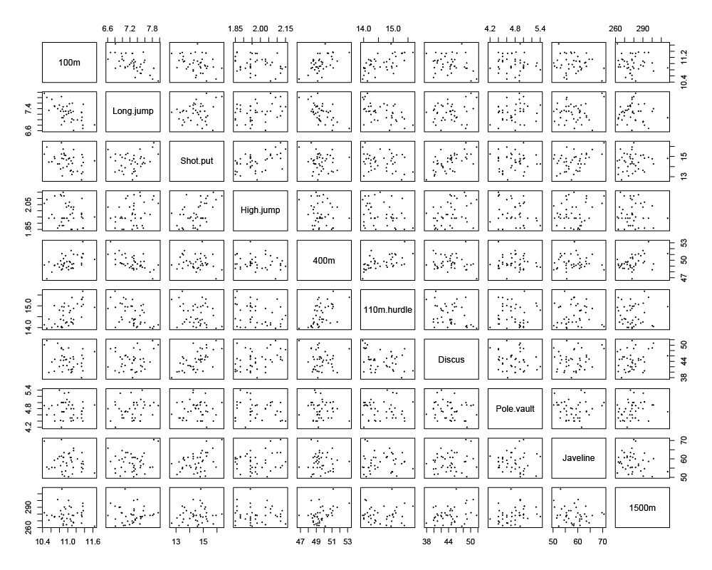
Figure 1 - Pairs plot matrix of the times or distances earned for the decathletes during the 2004 Olympic and Décastar games for all ten decathlon events.
As shown, the study of just ten variables requires producing and analyzing 45 unique plots (ignoring identity and reciprocal plots). Inspection of Figure 1 reveals many correlations, both direct and indirect. For example, competitors that performed well in the 100 m event tended to also perform well in the 110 m hurdles event. Also, competitors who jumped the farthest in the long jump ran shorter times in the 100 m and 400 m events.
Principal Component Analysis (PCA) is a statistical tool that we can use on this dataset to reduce the dimensionality of a dataset to its principal components. In this case, we will reduce ten dimensions of data down to two dimensions of data so that we can more easily graphically identify how the individual variables correlate linearly with each other. We can do this in both a variables factor map (see Figure 2) and an individuals factor map (see Figure 3).
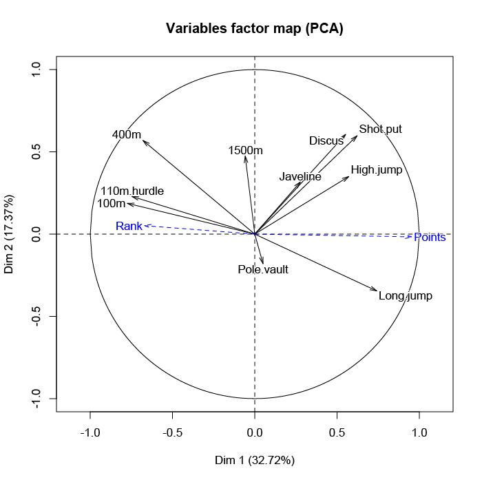
Figure 2 - Variables factor map between dynamic variables (in black) and additional variables (in blue). A vector with a direction and length represents each variable. Vectors with similar directions are more directly correlated, and the length of the vector presents the strength of correlation.
By analyzing Figure 2, we see that the "100m" variable is nearly opposite from the "Long.jump" variable. This implies that when an athlete performs a short time when running the 100 m dash, he can jump a big distance. This is because a low value for the variables "100m," "400m," "110m.hurdle," and "1500m" means a high score: the shorter an athlete runs, the more points he scores.
Supplementary variables are the "Rank" and "Points" earned by the competitors in the decathlon. Because winners of the decathlon are those who scored the most (or whose rank is low), these vectors point in opposite directions. The variables that are the most linked to the number of points are the variables that refer to speed events ("100m," "110m.hurdle," and "400m") and the long jump. Conversely, "Pole.vault" and "1500m" do not have a significant influence on the number of points. Competitors who perform well in these two events are not favored in the overall results of the decathlon.
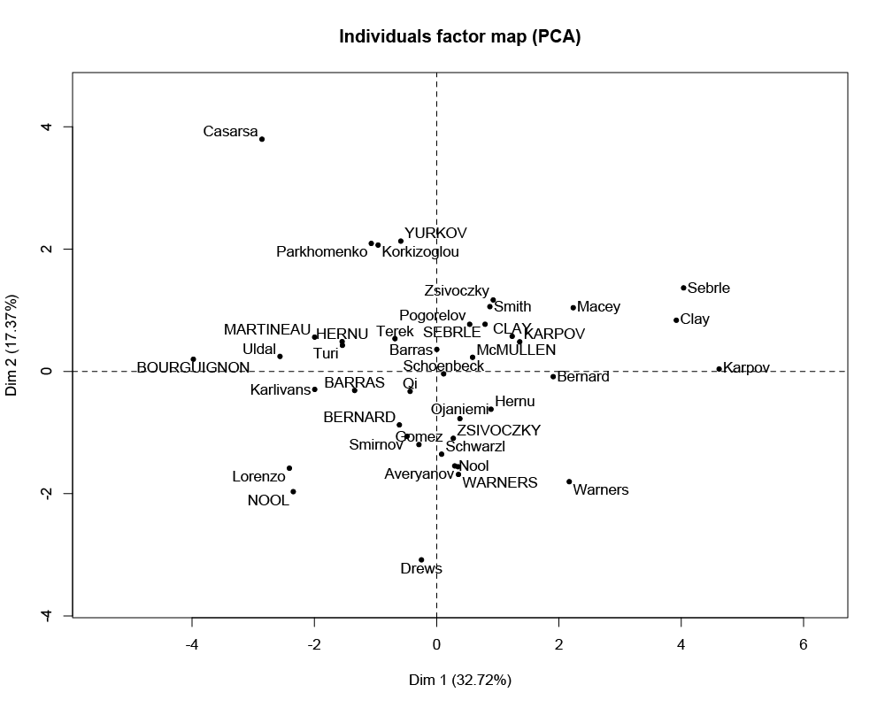
Figure 3 - Factor map between individual competitors. The right side indicates better all-around performance; the left side suggests poor all-around performance; the top-right quadrant indicates fast and strong competitors; the top-left quadrant indicates slow but strong competitors; the bottom-left quadrant indicates slow and weak competitors; the bottom-right quadrant indicates fast but weak competitors.
In Figure 3, the first axis opposes athletes who are "good everywhere' like Karpov during the Olympic games between those who are "bad everywhere" like Bourguignon during the Décastar. This dimension is particularly linked to the variables of speed and long jump. The second axis opposes athletes who are strong (variables "Discus" and "Shot.put") between those who are not. As can be seen in Figure 2, the variables "Discus," "Shot.put," and "High.jump" are not much correlated to the variables "100m," "400m," "110m.hurdle, " and "Long.jump." This implies that strength is not much correlated to speed.
PCA FOR MODERN BUSINESSES
Just as in my previous blog where I mentioned that Fourier analysis could be applied to business data, the same is true with PCA (and will be for future methods I discuss in subsequent blog posts). In the case of decathlon data, we discovered that the techniques of PCA helped us to easily visualize relationships between many variables by reducing the dimensions from many to a couple. The easy to read and interpret vector plot (see Figure 2) allowed us to graphically represent which variables were directly related, indirectly related, or even mutually exclusive. When used on business data, this could easily help identify which performance categories in your business are correlated with each other.
Additionally, if outside factors are also modeled alongside your company's performance categories, it could be determined what environmental factors (i.e., outside of your control, but potentially anticipatable) are positively or negatively influencing your business. It is important to know thyself, especially in industry. PCA allows you to truly analyze your business as a machine and how everything is connected. Most importantly, it will enable you to identify potential "Butterfly Effects," where small actions can lead to significant, seemingly unrelated results down the road. PCA helps discover those seemingly unrelated consequences and link them to their culprit causes.
BACK TO TOP
Fourier Analysis
July 4, 2015
Fourier analysis is the namesake branch of mathematics first formulated by French mathematician/physicist, Joseph Fourier (1768 – 1830). With the advent of computers, Fourier analysis has become increasingly powerful by using Fast Fourier Transform (FFT) algorithms. Simply put, Fourier analysis looks at time series data and identifies any underlying periods of repetition therein. It does so by transforming the time domain of a signal into a frequency domain by decomposing the function into sums of simpler (e.g., trigonometric) functions.
A notable example of this is the discovery of an 11-year solar cycle. Astronomers have kept detailed records of solar sunspot counts since the time of Galileo and the invention of the telescope just over 400 years ago. By inspection of the data, it is easy to see that number of sunspots on the Sun appears to fluctuate with time in a very periodic manner of maximum and minimum years of activity (see Figure 1).
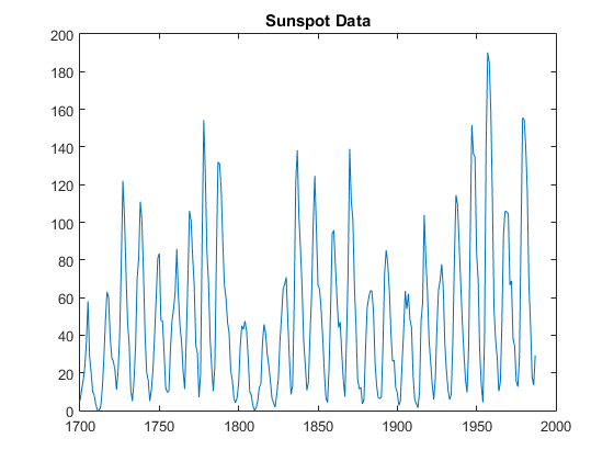
Figure 1 - Zurich sunspot relative number, tabulated over nearly 300 years.
By inspecting Figure 1, it is easy to notice that sunspot activity is very cyclical. It is clear that the period between successive peaks (or troughs) is roughly a decade. Fourier analysis, specifically an FFT algorithm implicated with computer software, will help us elucidate the exact period of repetition for this approximately decade long cycle (see Figure 2).
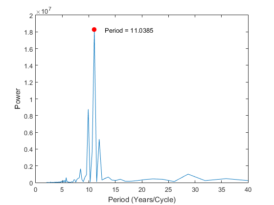
Figure 2 - Output graph of the results of the FFT analysis of the data in Figure 1. This reveals several prominent periods of repetition in the data, but the most robust cycle found is the 11.0385-year cycle.
As can be seen, Fourier analysis is a powerful tool for discovering quantifiable cycles in time series data. For business analytics, one merely needs to replace the astronomical sunspot data with any metric of your business over time. From the sunspot data (Figure 1), it is clear that there is a cycle. However, cycles are not always as apparent. An FFT can help discover cycles you didn't know about in your business. Once recognized, you will have gained a marked advantage in forecasting and accounting for aspects of your business that will predictably repeat themselves.
BACK TO TOPHOME